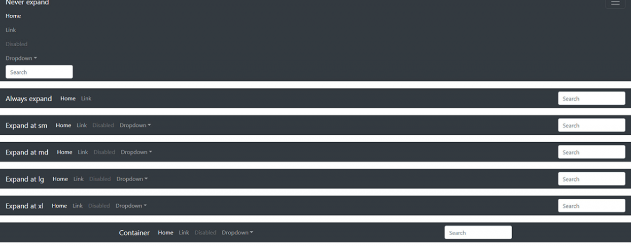
Design and functionality of menus in web design.
Designing the navigation or the menu requires careful planning. We need to think about what users will be looking for, what items to highlight and what kind of navigation is best to fit into a site design.
Sometimes smaller menus are a better option, and in other cases, depending on the number of sections of the site and amount of content overall, massive menus with lots of items are more suitable.
Fixed navigation
One of the more popular types of menus is the fixed menu, which is always at the top of the page and keeps tracking you constantly as you scroll the page. It is most commonly used in so-called "one-page" web sites, or as an additional menu on standard sites, when a section needs to be further subdivided. If fixed navigation is used, subtle shadows are often used to add depth to the page. When you're scrolling the page, it seems that navigation hovers above the content.
Responsive navigation
Definitely the most used navigation type at the moment, especially if it's a big menu. The menu is programmed in such a way that it adapts its look and functionality to the device or the screen on wich the website is viewed. Since dimensioning is automated, the menu does not take up too much space, and all items may be represented. On mobile devices there are so-called "hamburgers" or buttons with which the drop-down menu opens.
Fixed vertical navigation
With vertical navigation we can get the same functionality and good design as with horizontal navigation. It is not suitable for a menu with a lot of first level items because it depends on the height of the device, and if the navigation has to be vertically scrolled, we lose functionality and user expirience suffers. Most vertical navigation requires "sticky" style to be constantly present.
